In December 2021, I participated in a contest to design a web-based schedule for my university. At the time, my experience was mostly with vanilla HTML and JavaScript. Since React still relied heavily on class-based components, I chose Svelte instead. Its simplicity and low boilerplate made it ideal for rapid prototyping and an enjoyable developer experience.
Design choices
During the kickoff call, one of the organizers casually mentioned they liked iOS-style designs. That resonated with me - I’ve always preferred clean, minimal interfaces, so I decided to lean into that aesthetic.
I reviewed schedule websites from other universities. Many were difficult to use: cluttered layouts, confusing navigation, and poor mobile support. These pain points became clear opportunities for improvement.
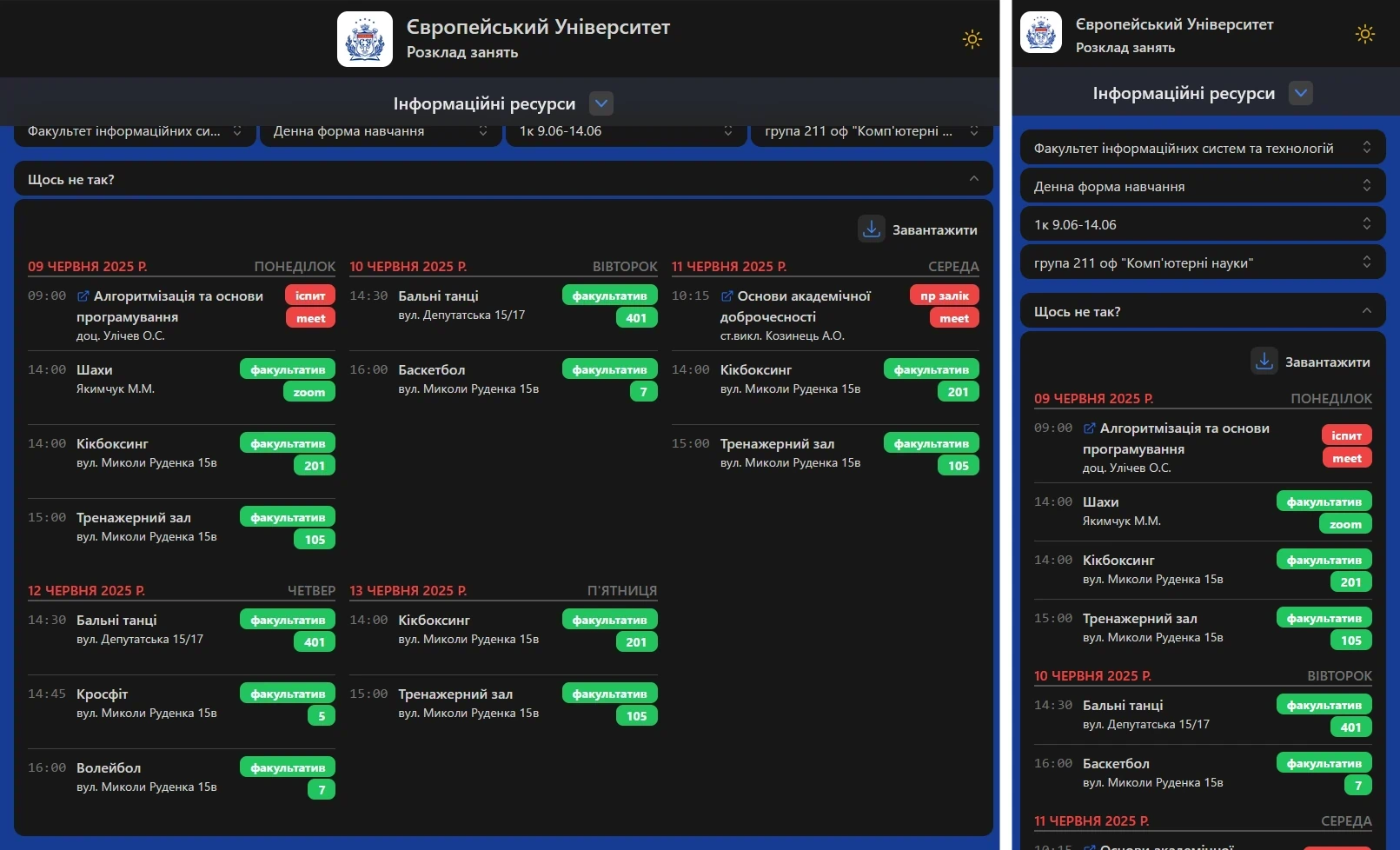
For inspiration, I turned to the Apple Calendar app. Its weekly view offered the clarity and structure I was looking for.
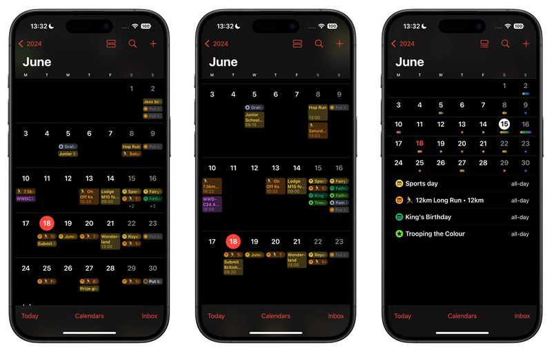
My design didn’t copy it directly but applied its principles of simplicity, clarity, and usability to create a schedule UI tailored to my university’s needs.
Going full client-side
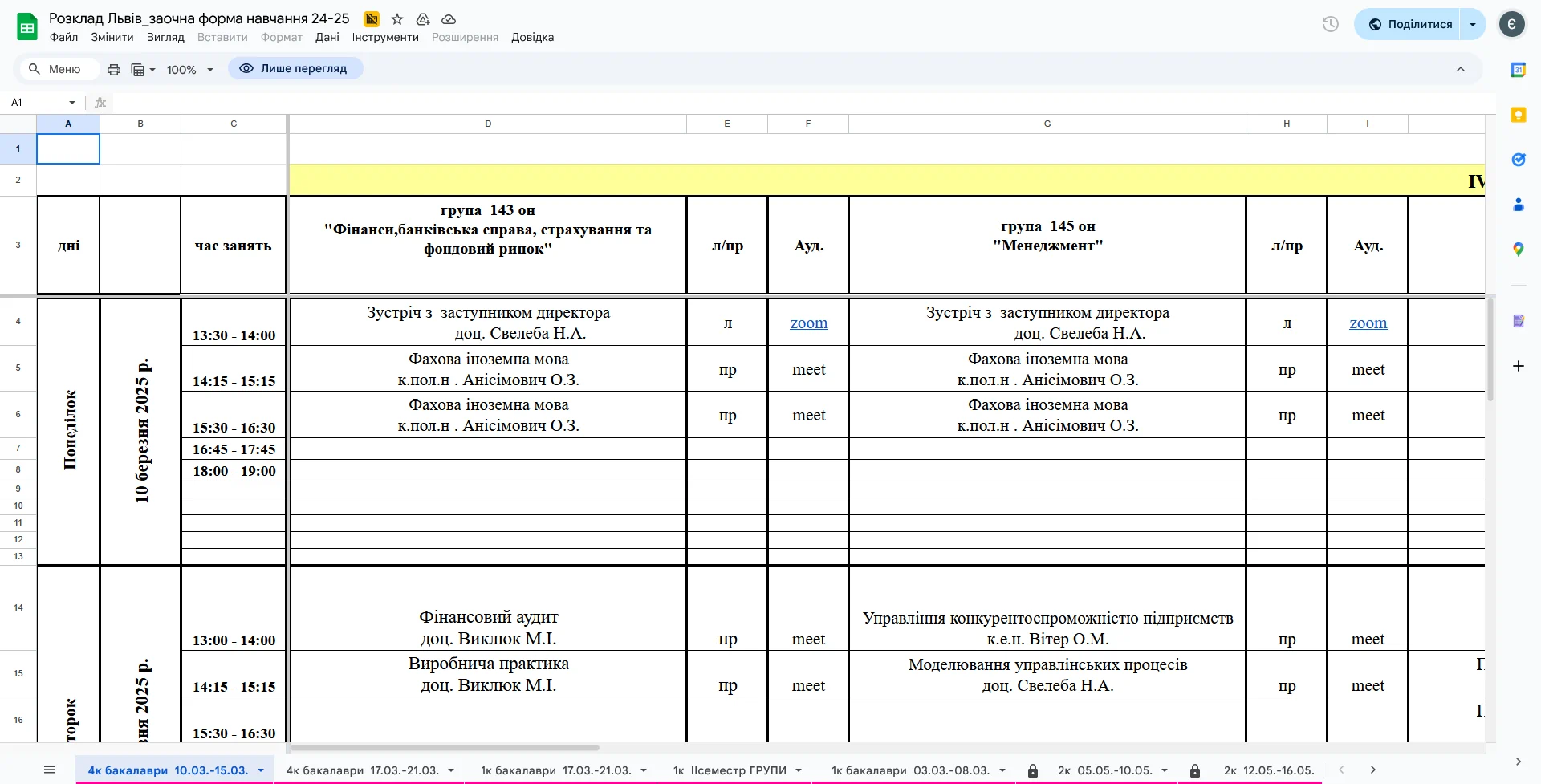
Most contestants relied on partially implemented back-ends or hard-coded data. I took a different approach: building the app as a fully client-side solution that:
- Pulled data directly from a Google Sheet
- Parsed a somewhat irregular spreadsheet format into structured data
- Dynamically determined the number of student groups each week
- Mapped each cell to the appropriate place on the calendar
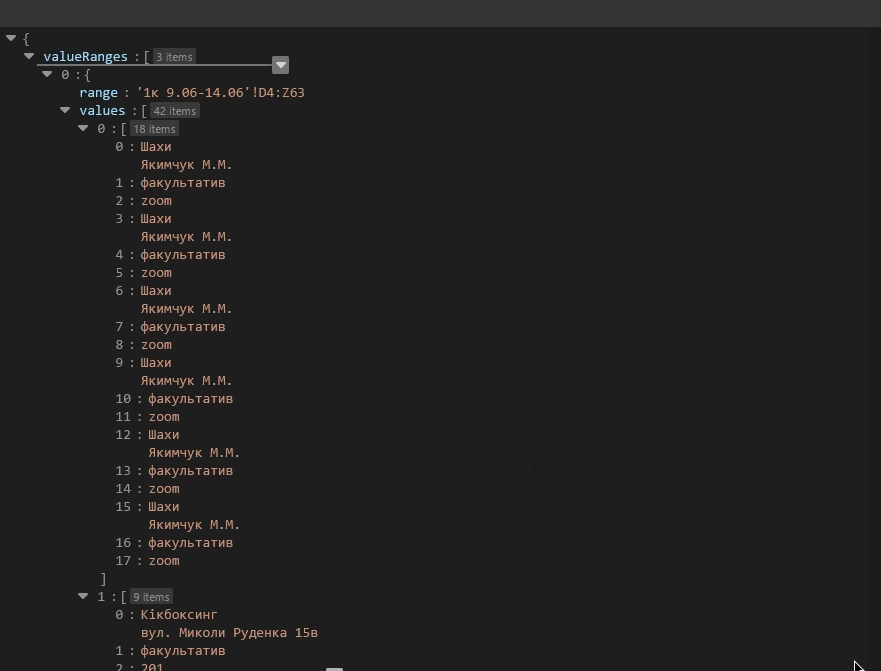
To achieve this, I wrote a custom parser that treated every cell as a small puzzle. The spreadsheet wasn’t designed for programmatic use, so I had to combine regular expressions with dynamic row/column mapping to extract the data reliably.
export async function loadTable(selectedFaculty) {
  const spreadSheet = await getSheet(selectedFaculty)

  if (!spreadSheet) return

  const sheets = spreadSheet.sheets
    .filter((sheet) => !sheet.properties.hidden)
    .map((sheet, index) => ({
      id: index,
      sheet: sheet,
      name: sheet.properties.title,
      // take all of the columns, remove the first 3 (time, date, day)
      // and divide by the width of a group (originally 3 columns)
      groups: Math.floor(
        (sheet.properties.gridProperties.columnCount - 3) / GROUP_WIDTH
      ),
    }))

  return sheets
}
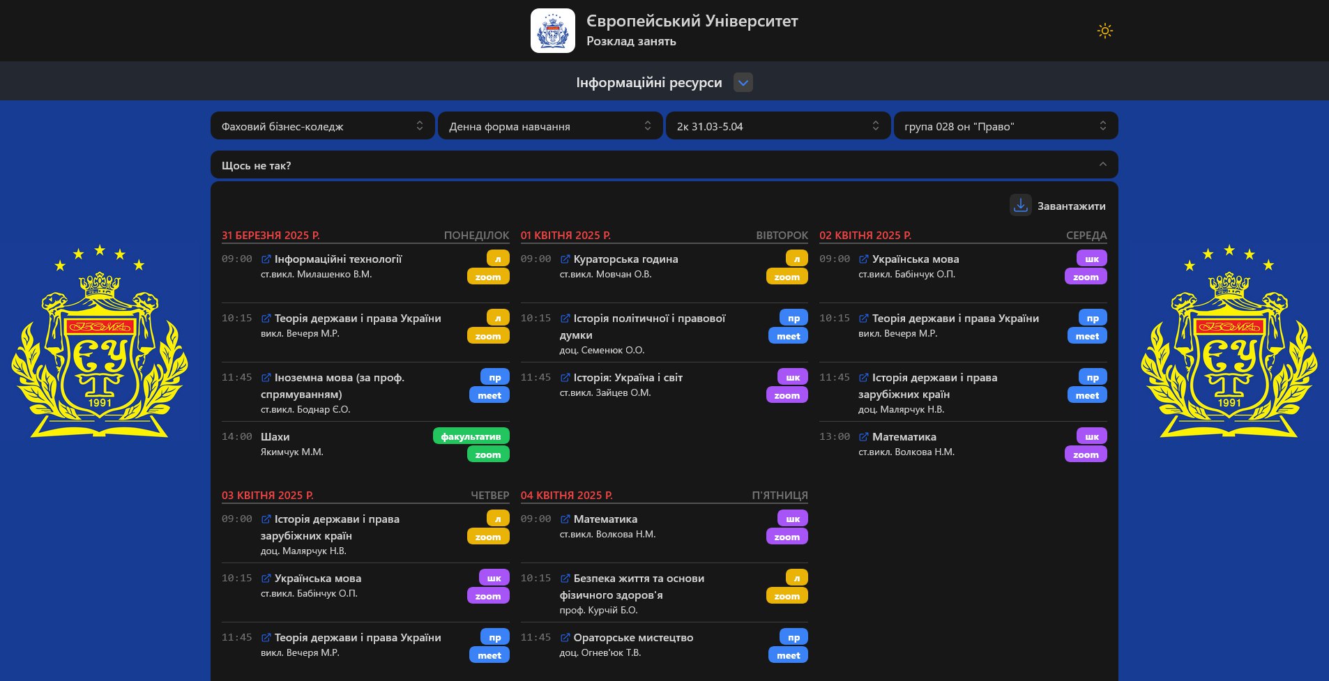
Quality-of-Life features
Besides the schedule itself, I added a simple navigation menu with quick links to:
- Student chats
- FAQ page
- Key-worthy pages
- Official resources
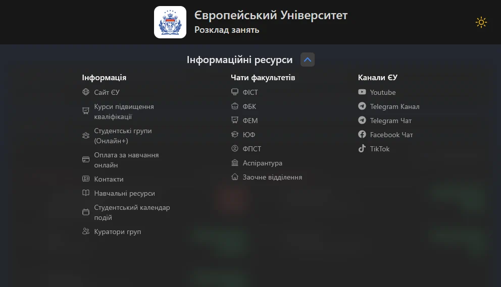
The app was fully responsive, optimized for phones, tablets, and desktops. This ensured that students could check their schedules anytime, anywhere.
By the end of the contest, my project was the only fully finished application. All required features were implemented, and the clean design — tightly integrated with the existing schedule system — stood out to the judges.
My app was selected as the contest winner and later deployed university-wide for everyday use.
After Launch
Once the app was live, I continued maintaining it throughout my studies, introducing updates based on student and staff feedback:
- Dark mode option for late-night schedule checks
- Screenshot tool so students could quickly share or save their weekly plan
- Colored groups to separate lectures, seminars, labs, etc.
- Web manifest to install the app as a PWA on any device
Shortly after deployment, the application was officially registered with the Ukrainian National Office of Intellectual Property and Innovations (UANIPIO), securing copyright protection of the codebase and UI design.
What I Learned
This project was a huge learning experience for me. It taught me valuable skills in:
- Frontend architecture (Svelte was a joy to use)
- API integrations (Google Sheets API is quirky but powerful)
- Handling real-world messy data
- Designing UIs that actually solve user pain points
And most importantly, the app became indispensable. Students, staff, and professors alike use it every day. It wasn’t just another school assignment or a side project that sat on GitHub collecting dust - it's an essential tool that made life easier for everyone at the university.